Mobile checkout UI is where online sales are won or lost. On a small screen, every extra tap, field, or delay is amplified, and so is the impact on conversion. Because mobile checkout is a critical touchpoint, UI improvements directly enhance the overall e-commerce user experience, making the entire shopping journey smoother and more satisfying for customers.
Below is a practical guide to designing mobile checkout interfaces that reduce friction and increase payment completion rates with expert advice from our UX/UI Designer.
What is mobile checkout UI
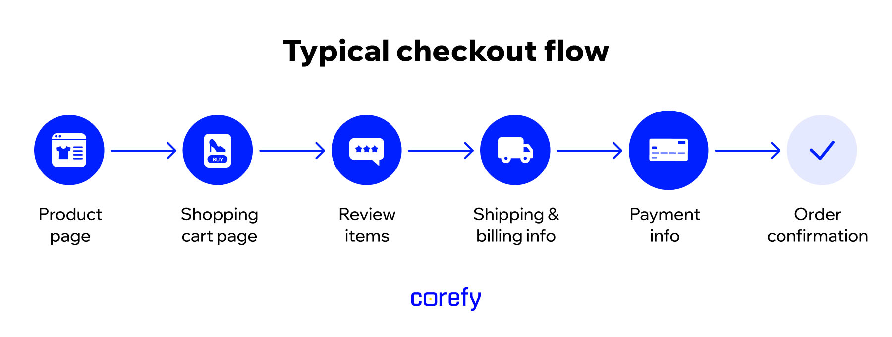
Mobile checkout UI is the set of screens, layouts, and interactive elements on a mobile website or app that guide customers through payment on a smartphone, tablet, or other mobile devices. It's everything the user sees and touches during checkout — from the order summary and input fields to payment method selection, error messages, progress indicators, and trust cues — all designed to make payment fast, clear, and low-effort on a small screen.
Mobile checkout itself is the full process that runs behind that interface. It includes order and invoice creation, payment processing, authentication such as 3D Secure (3DS), integrations with payment providers, and post-payment actions once the user taps 'Pay'.
A simple way to think about it:
Mobile checkout = what needs to happen for a payment to succeed
Mobile checkout UI = how that process is presented to the user

You can have a technically sound mobile checkout that still converts poorly if the UI creates friction. And you can have a great UI that underperforms if the checkout logic or payment stack behind it is rigid or unreliable. High-converting mobile checkout requires both to work together.
Importance of mobile checkout UI
Mobile is the primary channel for browsing, comparing, and buying. It makes the mobile checkout user interface a vital revenue lever for businesses. It directly controls how much of your mobile demand turns into real revenue.
Here's the practical breakdown of why mobile checkout optimisation makes sense:
- Most of your shoppers are on mobile. Mobile now accounts for the majority of retail e-commerce sales worldwide (around 59% in 2025, according to many estimates).
- Mobile checkout conversion usually underperforms desktop. Research shows mobile sites often convert significantly worse than desktop – sometimes less than half – even when mobile traffic is equal or higher. That gap is due to mobile phones making checkout more difficult when the UI isn't properly designed.
- Checkout friction is one of the biggest causes of lost sales. According to Baymard Institute, cart abandonment averages around 70% overall, and mobile abandonment is even higher (frequently ~80–85%). On small screens, issues such as long forms, unclear totals, or clunky payment steps have a greater impact on shoppers, increasing frustration and reducing their likelihood of conversion.
- Checkout UX improvements produce measurable lifts. Baymard's large-scale usability testing shows that the average e-commerce site can achieve up to a 35% increase in conversion rate by fixing checkout UX issues. Mobile is often where the wins are most significant because baseline friction is higher.
- Efficient mobile checkout improves retention and lifetime value. When paying feels effortless, customers come back. For repeat-purchase businesses, such as subscription services and digital goods, a seamless mobile experience reduces drop-offs.
- Mobile UI affects trust in your brand. Checkout is the moment users decide whether you're credible. If the flow feels confusing or unstable, people don't blame the phone; they blame the business. Clean UI and familiar payment options signal safety and competence. Optimising the UI can also improve search results, as it positively impacts user experience.
Across sectors such as e-commerce, SaaS, and high-frequency mobile services, mobile checkout is the point where intent turns into revenue. If the UI adds friction, you lose sales you already paid to acquire; if it feels fast and effortless, you capture more first-time purchases and make repeat buying a habit.
Core elements of mobile checkout UI
Mobile checkout user interface design centres on creating a payment experience that prioritises efficiency and security. Well-designed checkout pages are crucial for mobile users, as they directly impact user experience and conversion rates by reducing friction and making the process intuitive. Your layout can vary, but each element must clearly perform its role. Altogether, they guide users from cart to confirmation, and the most effective checkout solutions often share the building blocks we listed below.
Order summary
Pin it to the top of the page, make it expandable or collapsible, and display product names, prices, quantities, and the final total. Pricing should be transparent and upfront, including itemised costs, shipping charges, and taxes to prevent checkout surprises. If anything feels hidden or unclear, users pause and pausing on mobile often means leaving.

Contact and delivery details
Let users enter only the essentials, such as name, phone number (with correct formatting for mobile users), email, address, and notes, with minimal typing through autofill, address lookup, and smart defaults. Then allow them to pick from a clearly differentiated list of shipping options by cost and speed, with the best choice labelled and explained; and finally, show a clear estimated delivery date or range so they know what to expect.
Cart modification
Breaking the checkout flow by requiring users to navigate back to the cart page creates friction and increases the risk of drop-offs. Each step away from the checkout destination increases the likelihood of cart abandonment. Allow users to review product details, change quantities, remove items, apply discount codes, or go back a step without losing progress, which helps reduce cognitive load by making the process simpler and less mentally demanding.
Trust and security cues
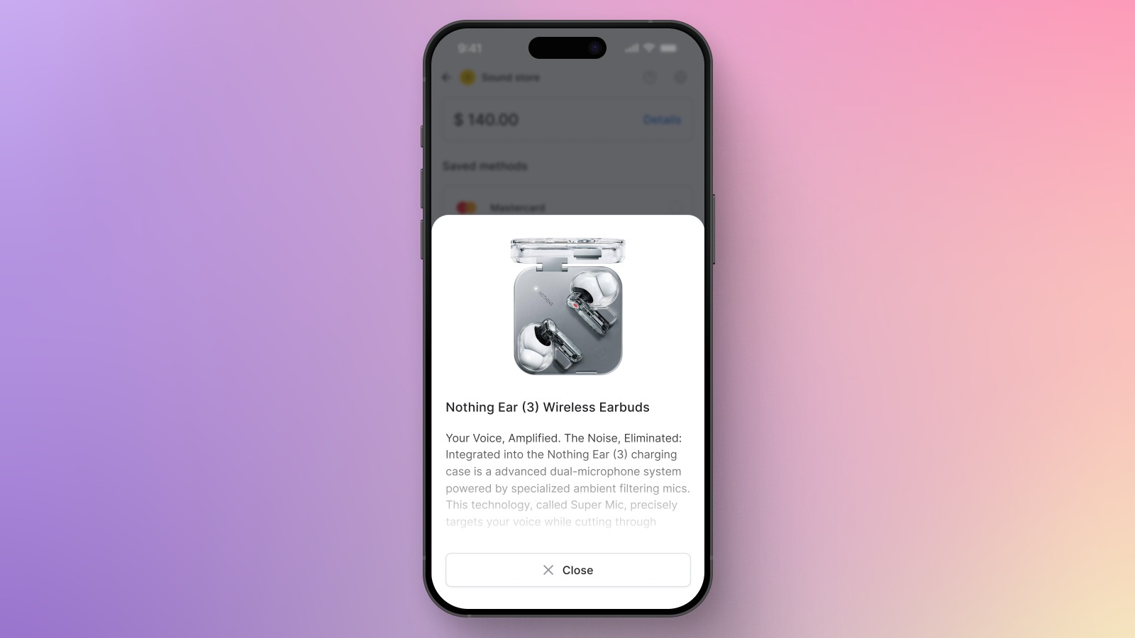
Use recognised payment logos (Visa, Mastercard, Apple Pay, Google Pay, PayPal), a brief 'Secure checkout' or PCI-compliance message, and an HTTPS/lock icon. Also, offer help where doubts appear: quick access to returns/refunds and delivery policies, concise FAQs, and a visible way to contact support or open live chat without leaving the flow. Many websites also display phone numbers at checkout to further reassure customers and reduce shopper anxiety.
Payment methods
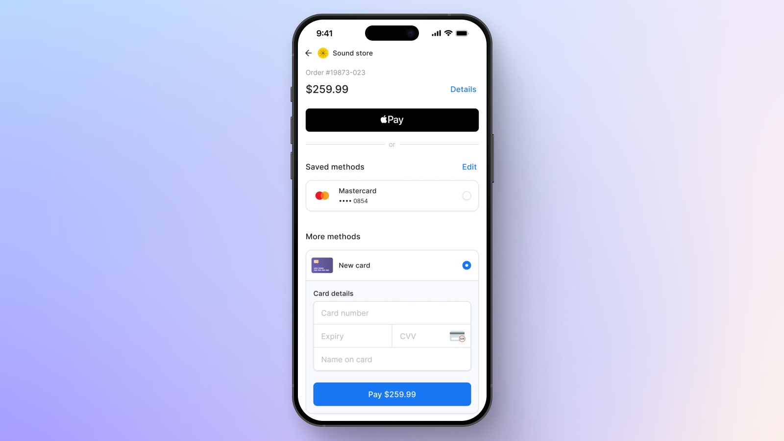
The UI must present the most relevant options first and clearly indicate how to pay with the selected option. Feature express checkout methods such as Apple Pay, Google Pay, PayPal, and 1-2 regional options (e.g., Klarna and buy-now-pay-later services) with clearly visible, recognisable icons, ideally before traditional card entry forms. Prioritising easy, mobile-friendly payment options ensures a seamless, fast, and secure mobile checkout experience.

Error handling
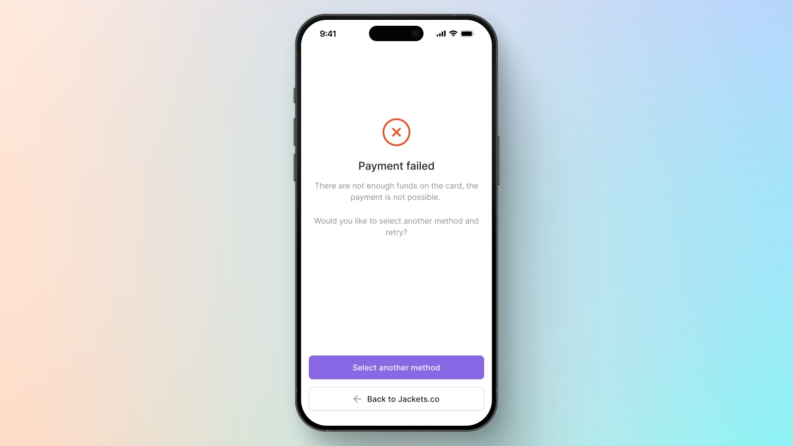
Errors often happen on mobile, as manual data entry on small screens is especially error-prone, but what matters is how they are recovered. Validate inputs inline, explain issues in plain language, and keep already entered data. 'Card declined' without a hint is a dead end, but 'Your bank rejected this card, try another card or wallet' gives a path forward.
Sticky call-to-action
A fixed 'Continue' or 'Pay now' button anchored near the bottom of the screen keeps the next step visible at all times, even as users scroll through their order or forms. The CTA should be large enough for a quick thumb tap within the natural reach zone for one-handed use and clearly indicate the next step (e.g., 'Continue to payment' or 'Pay $42.90'). Including a progress indicator alongside the sticky CTA helps users understand where they are in the checkout process, sets expectations for remaining steps, and reassures them with clear visual feedback.
Common challenges in mobile checkout
Mobile checkout challenges are rarely unique to a single product or industry and often share the same constraints: small screens, awkward input, distracted users, and third-party payment steps. When these constraints aren't accounted for, even motivated customers may fall out of the flow. In fact, shoppers abandon the checkout process at alarming rates when the UX is frustrating or confusing, even after showing clear purchase intent.
The patterns below are the issues most teams encounter first and the ones worth fixing before you optimise anything else:
- Too much typing. Phones are not built for forms, and checkout is often the longest form users have to fill out. Long inputs increase error rates, slow users down, and are especially painful on small keyboards, particularly when users are multitasking, on the move, or shopping in short bursts.
- Price surprises late in the flow. Hidden shipping costs or fees revealed at the end create 'price shock'. Users abandon not only because the total is higher, but also because the UI makes them feel tricked, which erodes trust right before payment.
- Early forced account creation. Registration before purchase adds an unnecessary decision at the worst time. People don't want to create passwords, confirm emails, or commit to an account before they've completed a single order, and many will leave rather than do extra work just to pay.
- Payment mismatch. Mobile users often default to wallets and local payment methods because they're faster, familiar, and already set up on their devices. If their preferred option is missing, hard to find, or buried behind extra taps, the checkout suddenly feels like a dead end even for high-intent buyers. Services like PayPal, Apple Pay, and Google Pay save users from manually entering credit card information and improve the experience.
- Weak feedback loops. Mobile shoppers need constant reassurance that the UI is responding. Buttons that don't react instantly, silent loading states, or vague error messages create doubt ('Did it work? Did I just get charged twice?'). On a phone, that uncertainty quickly turns into hesitation, which then turns into an exit.
- Disruptive authentication. 3D Secure challenges and bank redirects are sometimes necessary for fraud control, but they're a fragile moment in the flow. If users aren't warned about what's coming, if the screen change feels abrupt, or if they don't return to checkout smoothly, the experience feels like a failure rather than a security step.

Best practices to optimise mobile checkout UI
The mobile checkout best practices below target the most significant sources of mobile checkout drop-off.
Minimise steps and fields
Every field must earn its place. Strip checkout down to what's needed to fulfil the order and secure the payment, then make the path feel linear and predictable. Combine steps to reduce repetition, set the default billing method to shipping unless the user changes it, and avoid 'nice-to-have' questions that can wait until after purchase.
Use autofill and smart input helpers
Enable the phone's OS to automatically fill in common fields using the information the user has already saved on their device – contact details, addresses, and saved cards. Auto-completion features help save time at checkout by reducing input effort and minimising errors. Support helpers such as postcode/city lookups, card scanning, and input masks that format data as users type. With saved cards and autofill options, users don't always need to have their credit card handy, making the payment process even more convenient. But the key is speed without loss of control: autofill should feel like a shortcut, not a trap. Always allow manual edits, as a single incorrect default can cost the entire order.
Show express wallets early
If Apple Pay, Google Pay, PayPal, Shop Pay, or another express option is available, display it at the top of the payment options. These methods remove most of the typing and build trust through a familiar UI. By allowing users to avoid entering their credit card number directly, express wallets significantly improve both speed and perceived security. Don't hide fast options behind a 'More methods' accordion unless you have a strong reason.
Make the main CTA sticky and thumb-friendly
The primary action should stay visible and easy to tap. A sticky-bottom CTA keeps the next step visible as users scroll and makes one-handed checkout realistic. Keep it large enough for easy thumb taps, use only one CTA per screen, and label it with a clear outcome rather than a vague 'Next'. When users always know what will happen after a tap, they move faster.
Provide instant feedback
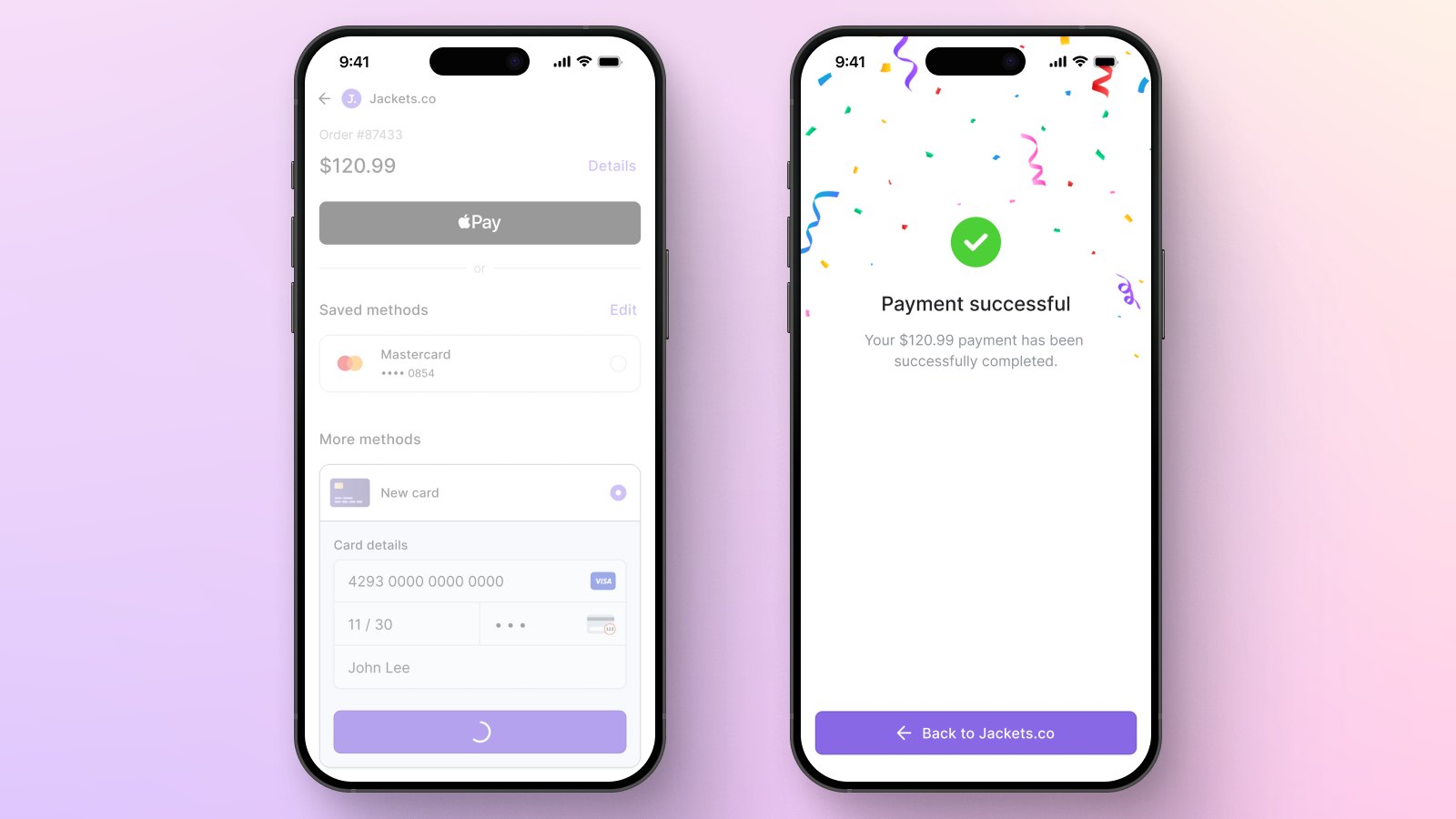
Mobile checkout happens in short, distracted bursts, so the interface must constantly confirm that it's responding. Validate fields in real time, acknowledge taps immediately, show clear loading and authentication states, and confirm the payment is successful. This prevents confusion that leads to double-taps, second-guessing, and drop-offs.

Offer guest checkout by default
Let people buy first. Requiring registration before payment adds a decision step and extra effort for users who want to proceed. Default to a clearly visible guest checkout option, as making this option easy to find significantly reduces cart abandonment and improves user experience. Then, offer account creation after purchase with a concrete benefit, such as order tracking, faster re-orders, or saved details.
Design errors for recovery
When something fails, users should know what happened and what to do next. If the error involves credit card information, provide clear guidance on what needs to be corrected to help users resolve the issue quickly. Highlight the problem field, keep everything else intact, and offer a fix. If the issue is outside the user's control (e.g., issuer decline or network error), state this clearly and offer a next step.
Build for real-world mobile conditions
Assume one-handed use, small screens, weak Wi-Fi, and interruptions. Use large tap targets (at least 44px), one-column layouts, light pages, and local state saving so a notification or app switch doesn't wipe progress.
Make accessibility non-negotiable
Accessibility is conversion protection. Support OS text scaling, use real labels (not placeholders), maintain strong contrast in bright environments, and make focus states visible. These improvements help users with disabilities, older shoppers, tired users, and anyone checking out in motion or poor lighting, which accounts for a large share of mobile commerce.
The future of mobile checkout UI
These three major shifts are already shaping how the next generation of mobile checkouts will look and feel.
Wallet-first checkout becomes the default
Wallets already account for around half or more of e-commerce transaction value worldwide, with Europe expected to pass 40% of e-commerce payments via wallets in 2025. As wallets absorb identity, shipping details, and biometric confirmation, manual card entry feels increasingly outdated. This also ties into passwordless authentication: people activate passkeys, and major platforms now support them at scale, which is pushing checkout toward 'tap + biometrics' rather than 'tap + OTP'.
Adaptive checkout flows
The best mobile-friendly checkouts adapt to the user and context, recognising returning vs. new customers, offering region-preferred methods first, and adjusting the flow based on cart size or risk profile.
Here are a few examples:
- Amazon's mobile checkout adapts significantly based on whether you're a returning buyer. If you have saved address and payment details, the flow transitions to near-confirmation mode with defaults preselected; if you're new, it expands to collect only what's required and guides you step by step.
- Airbnb's checkout supports multiple currencies and local payment methods depending on user location, and in some markets it offers pay-over-time options for higher-value trips. The flow also changes for group travel scenarios (e.g., split-pay experiences) and for returning users with stored details.
- Uber uses a unified 'Checkout Actions' framework that dynamically inserts only the steps needed for that specific transaction — for example, skipping friction for low-risk users, but adding identity checks, arrears clearing, or extra authentication when the system detects risk. Two customers can see different checkout steps for the same service depending on context.
Less visible fraud friction
Fraud controls aren't going away, but they're becoming more streamlined. 3D Secure 2.2 is rolling out widely in 2025, with features such as delegated and decoupled authentication, which enable more checks to occur in the background or via familiar biometric prompts instead of clunky redirects. These measures are especially important for credit card transactions, where optimising security without adding unnecessary friction is critical to maintaining user trust and conversion rates. Combined with improved risk scoring and routing, this moves checkout toward 'frictionless unless needed,' and when a challenge is required, users will see an in-flow step that feels like part of the app, not a jump to an unknown destination.
Real-world mobile checkout UI examples to learn from
The mobile checkout examples demonstrate how modern mobile checkouts reduce effort, keep users oriented, and make payments feel secure.
Wallet-first, one-tap confirmation flows
Express wallet sheets (Apple Pay, Google Pay) remain the fastest mobile checkout option because they consolidate identity, address, and payment into a single, familiar, biometric-verified step. The best wallet-first designs make this path the default, with manual card entry as the backup, not the other way around.
Here's an example of this approach at Corefy's mobile checkout, where the interface keeps the order review short and then hands off to popular wallet solutions for a one-tap finish.
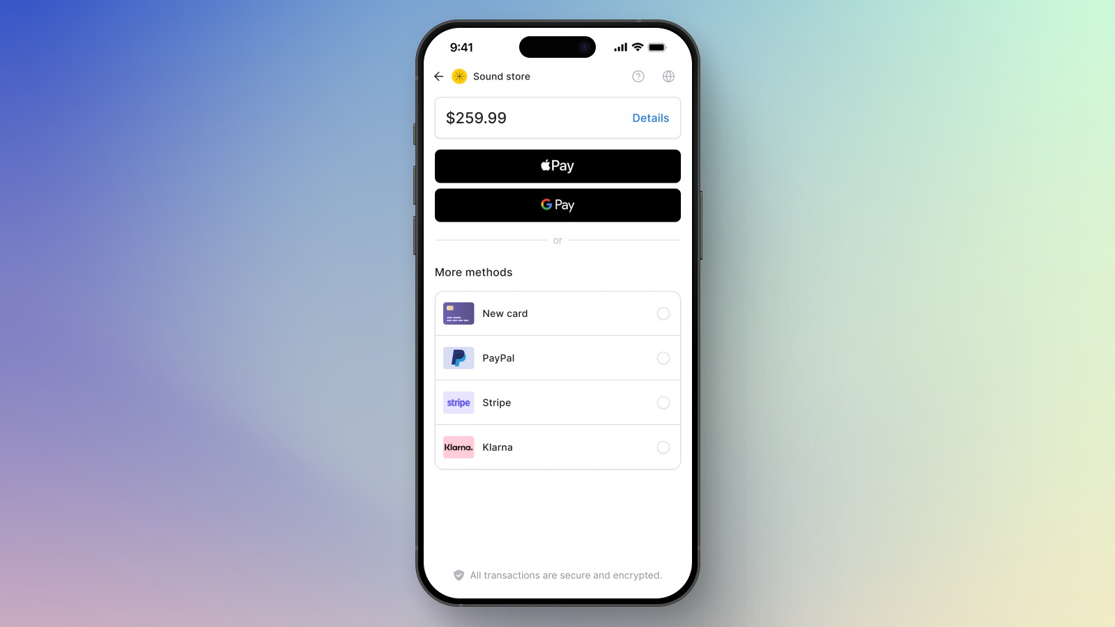
Why it works: minimal typing, high trust from native UI, and a clear moment of confirmation.
Persistent order summary with an expandable bottom sheet
One of the smartest mobile patterns is keeping pricing visible while users fill in details. Instead of forcing users to scroll back up to check totals, the UI uses a collapsed summary bar that expands on tap. The HelloGov – Mobile Checkout Order Summary Exploration shows this nicely: a persistent bottom summary keeps the total in view, with an expand/collapse sheet for item and fee details.
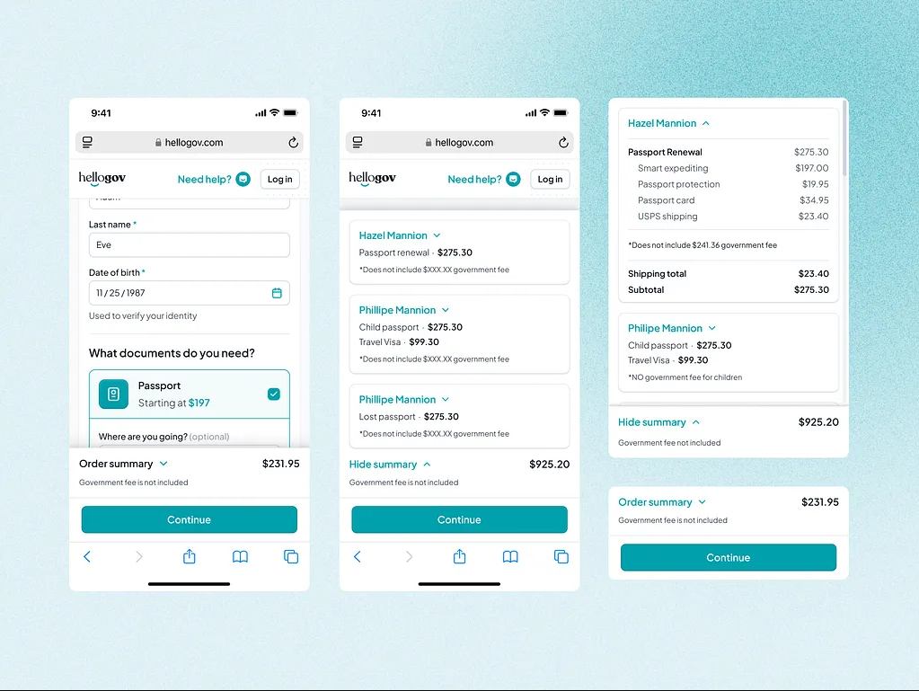
Why it works: reduces anxiety about 'what am I paying?', prevents late price shocks, and supports quick in-flow edits.
Step-by-step checkout with clear milestones
Some baskets require multiple steps, but the flow feels long only when users can't see progress. The Checkout Process Mobile App Design concept offers a crisp example of a guided, multi-step path from cart to confirmation. Each screen has one job, and the user always knows what's next.
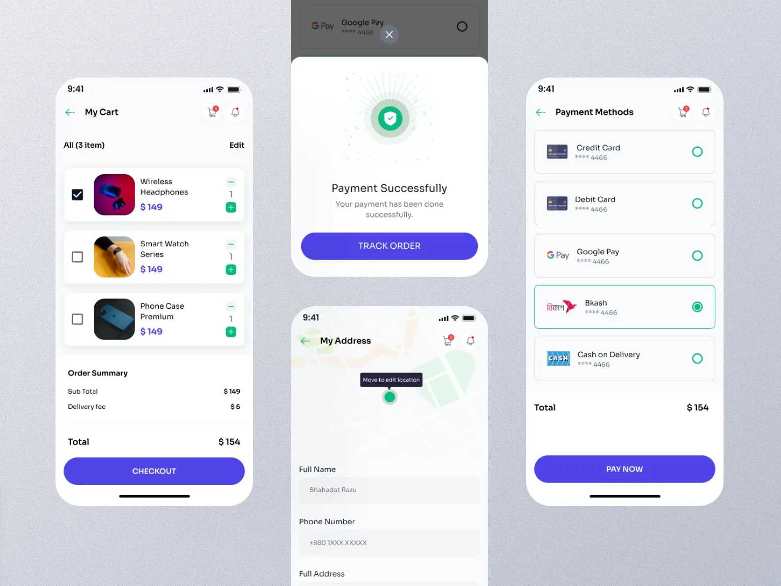
Why it works: predictable sequencing, low cognitive load per step, and a clear sense of completion.
Turn your mobile checkout into a revenue engine with Corefy
Even a well-designed mobile checkout can underperform if the payment layer is rigid. With a flexible white-label payment gateway behind your UI, you can eliminate many of the hidden issues that quietly drain revenue.
Corefy removes that friction behind the scenes, so your checkout stays fast and clear for users.
What you gain with Corefy:
- Launch and adjust payment methods without rebuilding checkout every time. Add wallets, local methods, or new PSPs through a single orchestration layer rather than through repeated direct integrations.
- Keep payment choice simple on mobile. Show a curated, device- and region-relevant set of methods, avoiding long lists that cause hesitation.
- Higher approval rates through smart routing and cascading. Transactions are automatically routed through the best-performing paths, reducing false declines that harm conversion.
- Clear visibility into what's hurting conversion. Unified analytics by method, PSP, country, and device help you see whether friction is coming from UI or payments and fix the right thing.


.png)
