10 proven tactics to increase checkout conversion rate and boost your sales


The efficiency of your checkout process is not just a component of your e-commerce strategy — it's the backbone. With statistics from 2023 revealing a staggering 70% cart abandonment rate, optimising your checkout conversion rate becomes critical. This article explores strategic enhancements to your checkout process that can significantly uplift your sales.
The checkout conversion rate is a pivotal metric, denoting the percentage of customers who complete a purchase against the total number who added items to their cart. This figure reflects the efficacy of your checkout process — a high conversion rate implies a seamless, frictionless checkout experience. In contrast, a lower rate signals potential hurdles customers face during the final purchase stages.
Benchmarks for checkout conversion rates fluctuate across industries, yet a universal truth remains:
Another essential metric directly related to your conversion rates is shopping cart abandonment. The Baymard Institute's comprehensive analysis underscores an average abandonment rate of nearly 70%, pointing to a widespread challenge across e-commerce platforms to retain customers through the final purchase phase.
The formula for calculating your checkout conversion rate is straightforward: divide the number of completed purchases by the total number of shopping carts created, then multiply by 100 to derive a percentage. This calculation offers a clear lens through which to view your checkout process's effectiveness, serving as a baseline for measuring the impact of any optimisations you implement.
For every online business, the usability of its website is the bedrock of its success. In this regard, it is crucial to think of a checkout page as the essential component of your website, which it truly is. However, some businesses still neglect it, resulting in consumers' frustration and lost sales.
Various studies confirm that more than half of consumers have experienced technical issues at the checkout page or abandoned a complicated payment process in the past. For merchants, it means an inevitable increase in the shopping cart abandonment rate.
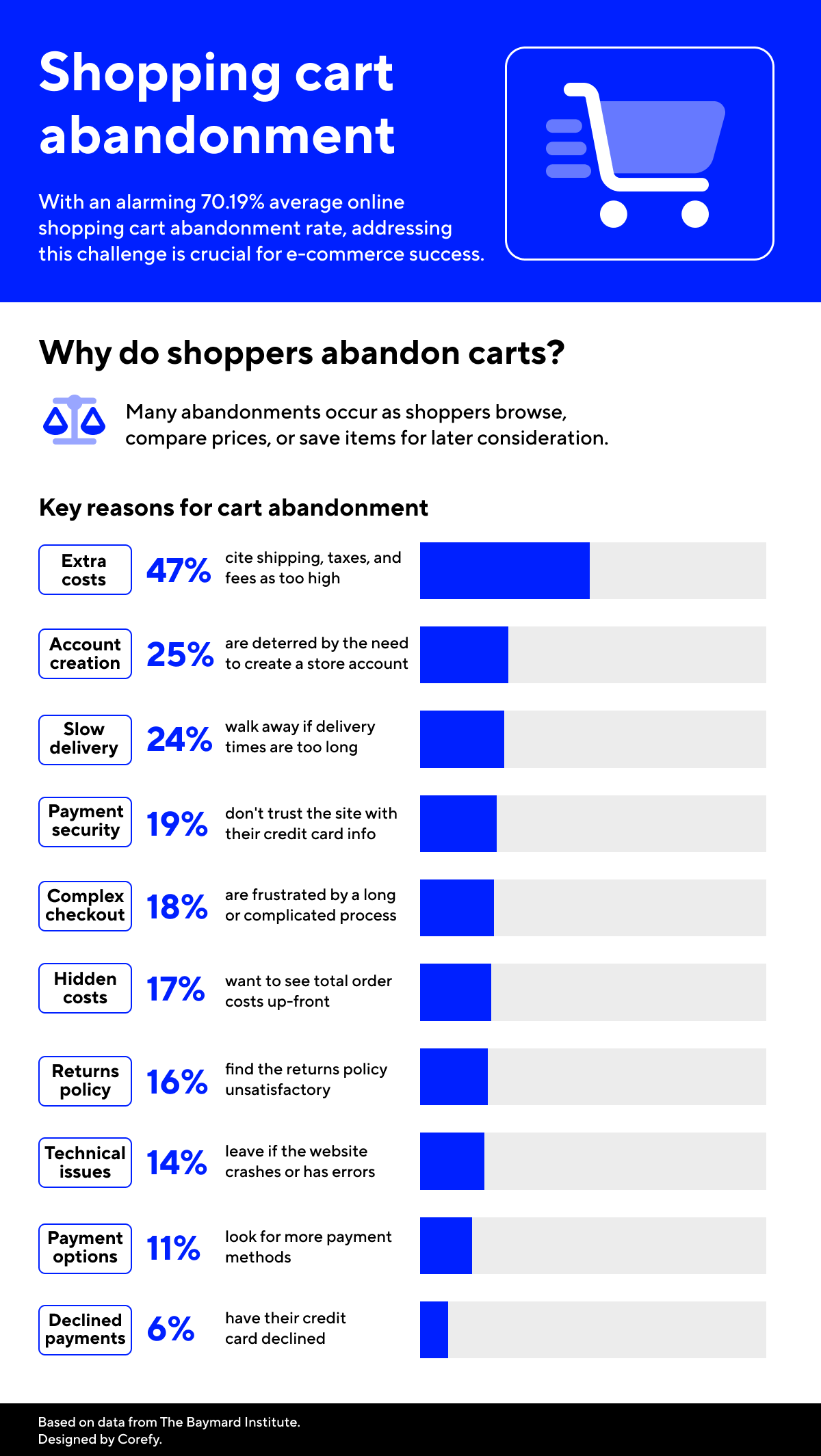
One of the most cited reasons for cart abandonment is the added cost of shipping. A study by the National Retail Federation found that offering free shipping directly correlates with a reduction in cart abandonment rates. Moreover, a clear and lenient return policy can significantly diminish purchase hesitancy, thereby boosting conversion rates.
So, here are some tips you can consider:
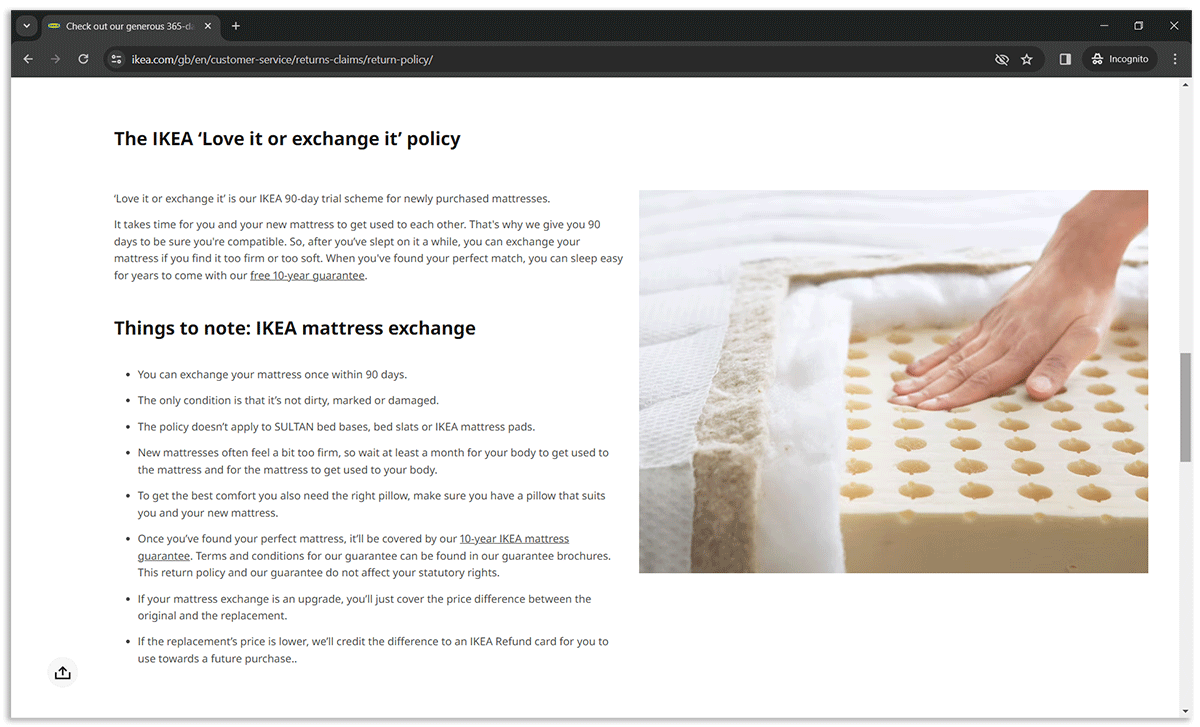
IKEA's approach to returns and shipping is a clear example. Their 365-day return policy for unopened products, hassle-free returns, and the ‘Love it or exchange it’ 90-day trial for mattresses reduce purchase hesitations, encouraging customers to complete transactions with the assurance that their satisfaction is a priority. Such policies enhance the shopping experience and build trust, which is crucial for repeat business and positive word-of-mouth, ultimately boosting conversion rates.
A complex or lengthy checkout process can deter customers from completing their purchases. Streamlining the checkout to remove unnecessary steps and asking for only essential information can reduce friction and improve the overall user experience. In practice, some businesses address this by using white-label checkout solutions, which allow them to simplify the flow while keeping the payment experience aligned with their brand.
Best practices for optimised checkout process:
.png)
Forcing customers to create an account before they can make a purchase is a significant barrier that can lead to increased cart abandonment. Here are a few suggestions:
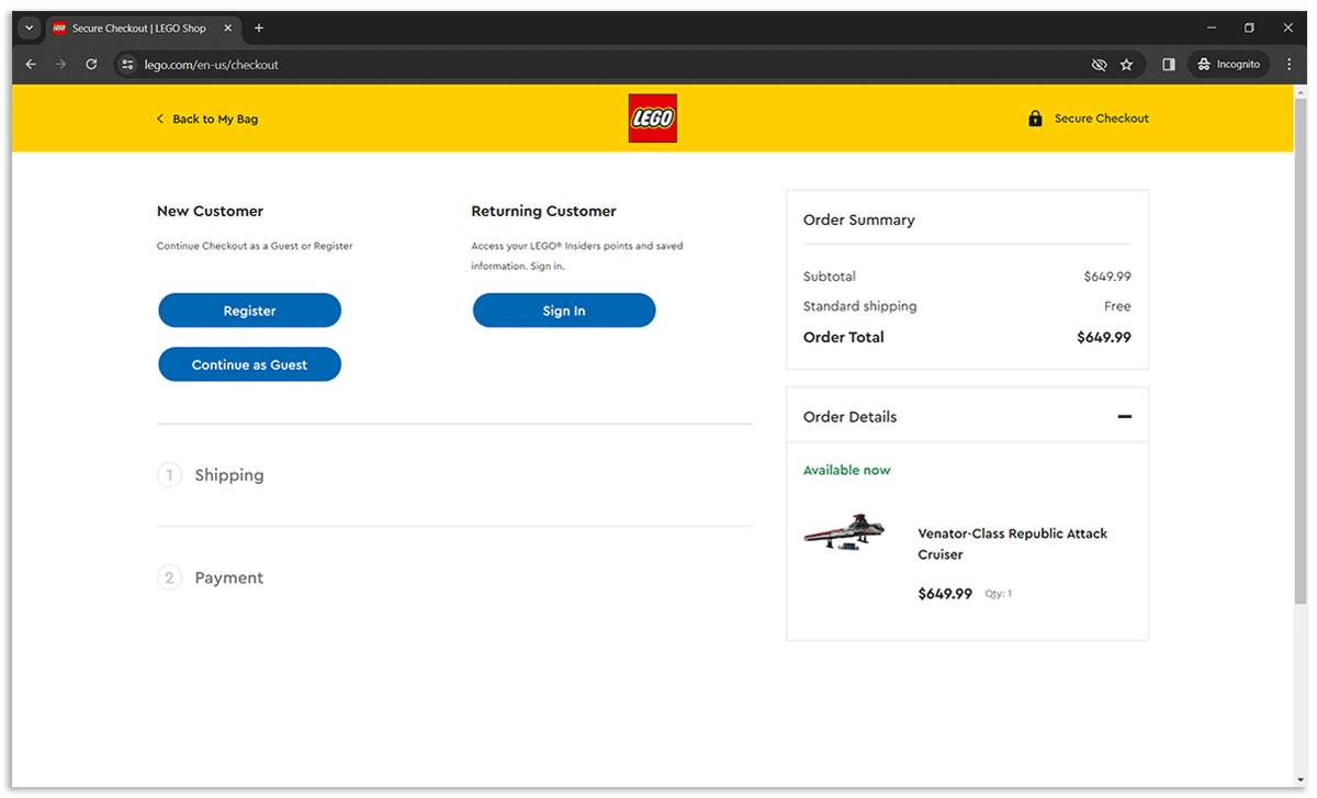
LEGO's checkout process exemplifies this approach. Customers are given the choice to continue as guests or to log in or register, which can streamline the process and reduce friction. This option caters to both first-time shoppers and those who prefer a quick checkout without the commitment of creating an account, thus enhancing the user experience and potentially increasing the likelihood of completing a purchase.
According to Statista, mobile sales reached $2.2 trillion in 2023 and now account for 60% of all e-commerce sales worldwide. It means optimising the mobile checkout experience is no longer optional — it's imperative. A seamless mobile checkout must accommodate the nuances of mobile navigation, prioritise speed, and minimise typing.
Key things to do:
Let’s take a look at Sephora’s mobile checkout. It offers plenty of payment options, including mobile wallets with quick payment flows. For those who prefer paying with a card, Sephora ensured autofill for card details fields, making the payment process simple and effortless.
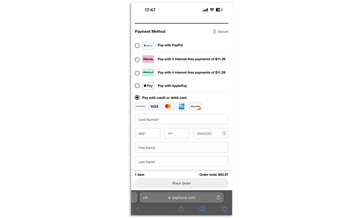
Diversity in payment options caters to a global audience with varying preferences. The Baymard Institute found that 6% of cart abandonments occur due to a lack of preferred payment methods.
Here’s what you can do about it:
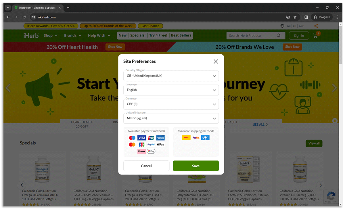
On its website, iHerb offers a decent selection of payment options. Besides, you can see the list of available payment methods before checking out. It is shown in site preferences and differs for each country.
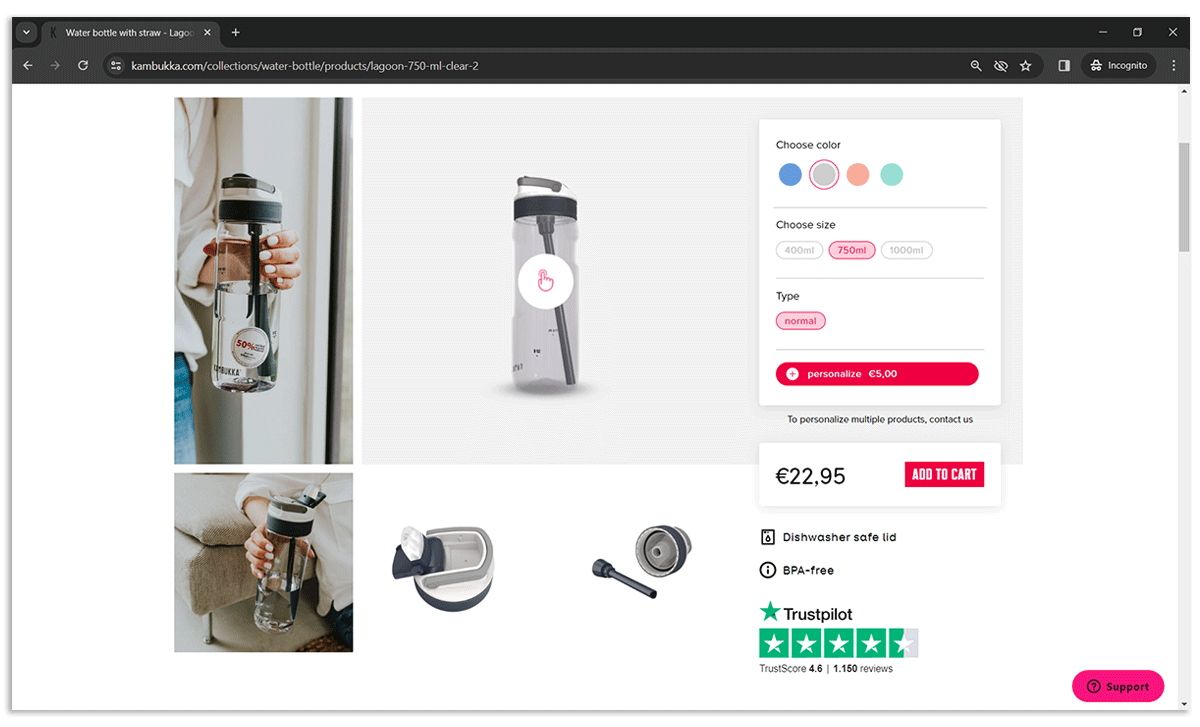
Social proof, including user reviews and ratings, significantly impacts purchasing decisions. In a 2022 survey, 71% of US consumers agreed that a good Trustpilot score makes them more likely to buy from a brand. That’s why we recommend:
Kambukka prominently displays customer ratings and reviews on product pages and within the checkout flow, providing valuable social proof to prospective buyers.
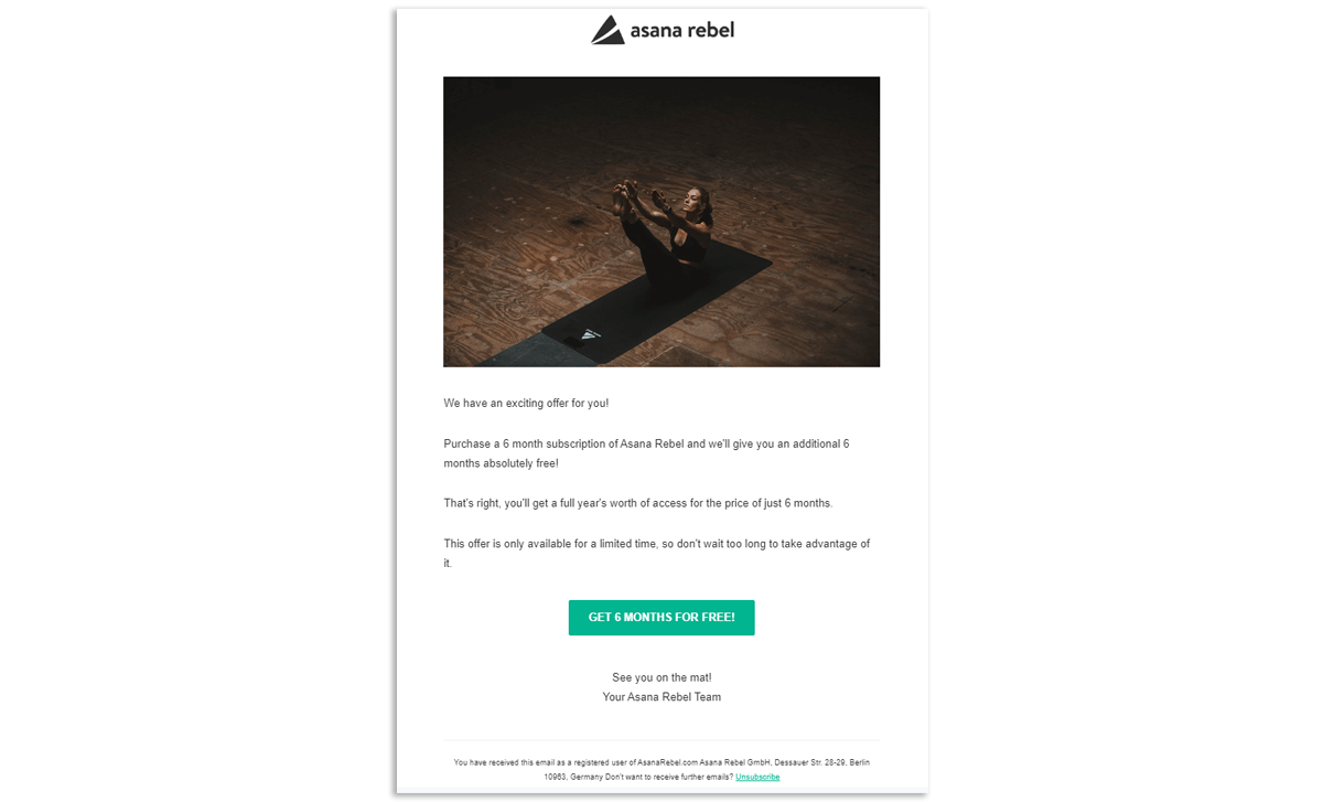
Abandoned cart recovery is crucial, with email being a particularly effective channel. Moosend reports that abandoned cart emails have an average open rate of 40-45%. Here are some of the tips for recovering lost sales:
For example, here’s an email the Asana Rebel app sends to the users who downloaded the app but didn’t purchase a subscription. It includes a time-limited discount offer to encourage immediate action.
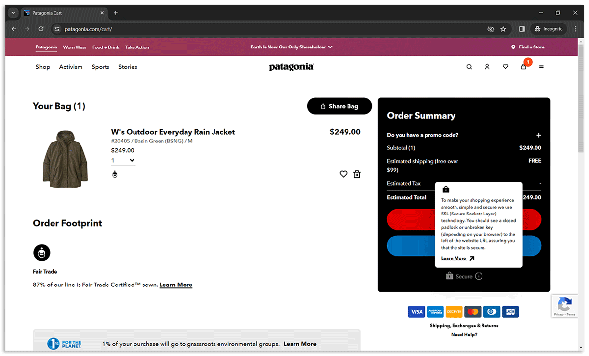
Trust is a critical component of the checkout process. Most online shoppers avoid purchasing from websites they deem as insecure. That’s why it’s crucial to:
Patagonia's checkout process includes a clear message about the use of SSL technology to secure online transactions. They have placed an informational badge reassuring customers that their shopping experience is protected, and this security measure is visually reinforced by the closed padlock icon.
Personalisation can significantly impact the checkout experience, leading to higher conversion rates. Epsilon research indicates that 80% of consumers are more likely to make a purchase when brands offer personalised experiences. Personalisation in the checkout process can range from displaying items based on past behaviour to personalised discounts.
But where to start?
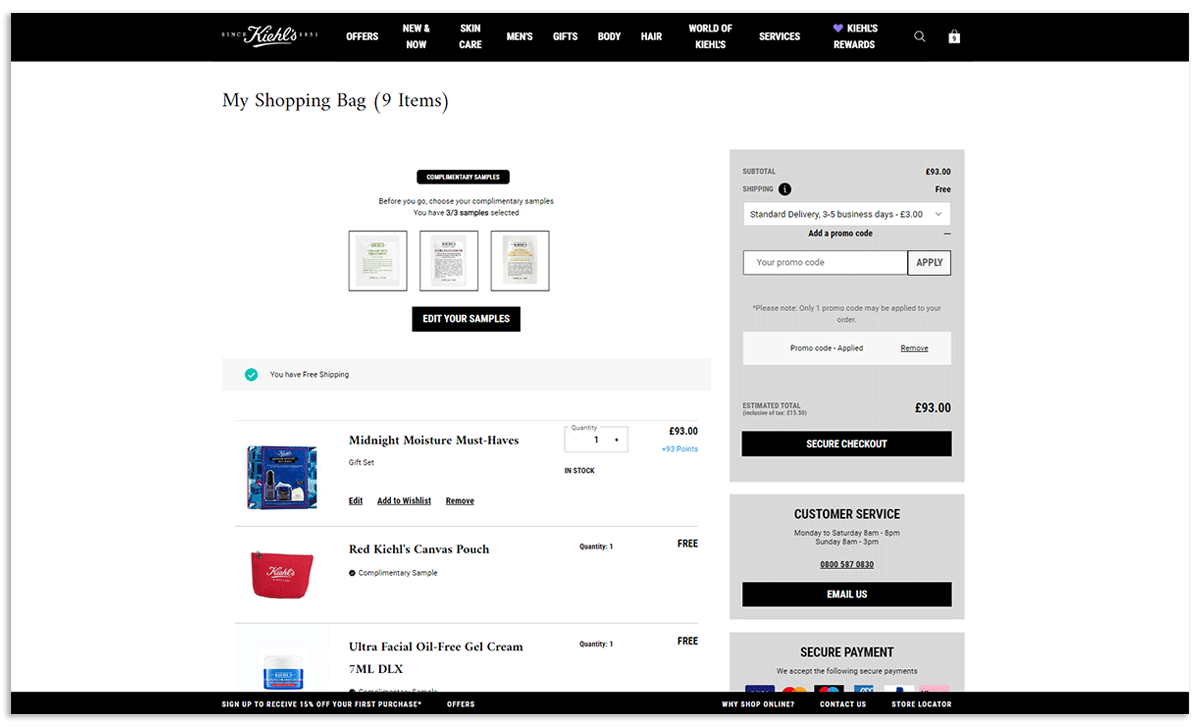
Kiehl's personalisation approach enhances the online shopping experience by offering signed-in customers tailored incentives. These include free delivery, the ability to select complimentary samples, and a special gift redeemable with a promo code sent via email. This strategy creates a sense of valued personal touch, encouraging brand loyalty and increasing the likelihood of repeat purchases.
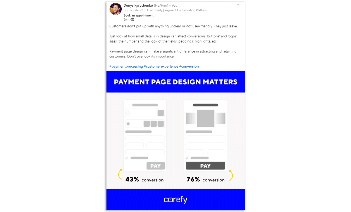
The design and layout of your checkout page play a crucial role in minimising distractions and focusing the customer's attention on completing their purchase. A well-designed checkout page is not only aesthetically pleasing but also functional, reducing cart abandonment rates. That’s why:
Effectively tracking and understanding your checkout conversion rate is essential for optimising your e-commerce website's performance. Here are the tools you can use for this:
In addition to the checkout conversion rate, e-commerce businesses should keep an eye on several other vital metrics that provide deeper insights into the checkout process's effectiveness:
Corefy offers a suite of features designed to enhance checkout conversion rates, with clients observing an increase between 10-25%. This section delves into how our payment orchestration platform empowers businesses with advanced strategies and techniques for conversion optimisation, supported by illustrative client stories.
Corefy simplifies the checkout experience with instant and one-click payments, eliminating the need for returning customers to re-enter their payment details. This convenience significantly reduces checkout time, a key factor in boosting conversion rates, as it aligns with the modern consumer's expectation for speed and efficiency. A notable implementation saw a client enhance repeat customer transactions, highlighting the direct impact on customer retention and conversion uplift.
Corefy enables the creation of tailored routing and cascading strategies that consider a wide range of transaction parameters, from card issuer details to transaction amounts. This granularity in routing decisions ensures that each transaction is processed through the pathway with the highest likelihood of approval.
Our PSP client’s journey from a 56.2% conversion rate to an impressive 85.1% within a year underscores the power of a meticulously crafted routing strategy, combined with cascading and UX improvements, in achieving significant conversion rate growth.
The card binding feature offered by Corefy significantly enhances payment acceptance rates by optimising transaction flows based on historical success. By binding a customer's card to the Merchant ID (MID) that previously processed a successful transaction, subsequent payments are streamlined, leading to improved approval rates. A practical application of this feature saw a forex client increase their acceptance rates, showcasing how smart routing based on past success can lead to tangible improvements in transaction success rates.
Payment team as a service is how we refer to the payment guidance and support we provide to our clients. Based on our payment expertise, we perform tasks varying from daily operations to forming feature requests, solving issues with providers, developing payment expansion strategies, and more.
Here’s a brief recap of a case that illustrates our capacity to pinpoint and resolve intricate problems, leading to substantial conversion rate improvements: a major PSP client faced a dismal 14% conversion rate with Google Pay due to issues in the provider’s interaction with the issuer. Corefy’s intervention rectified these issues and boosted the conversion rate to 84% after implementing recommended adjustments. More on this here.
By providing a comprehensive overview of transaction data, our Dashboard enables businesses to identify and address inefficiencies within their payment processes, allowing for continuous optimisation based on real-time performance. This works especially well with the payment team as a service, when our Account Managers monitor clients’ data to help them detect areas for improvement.
One example is the case of our ISO/MSP client. Their dedicated Account Manager noticed that transactions in a particular currency were unstable on their live graphs – the conversion was low due to many failed transactions. Together with th client, they analysed the transaction statuses and found the reason – they used only one payment provider for this currency, and this provider experienced downtimes. After connecting one more provider and configuring cascading rules, the number of failed transactions decreased.
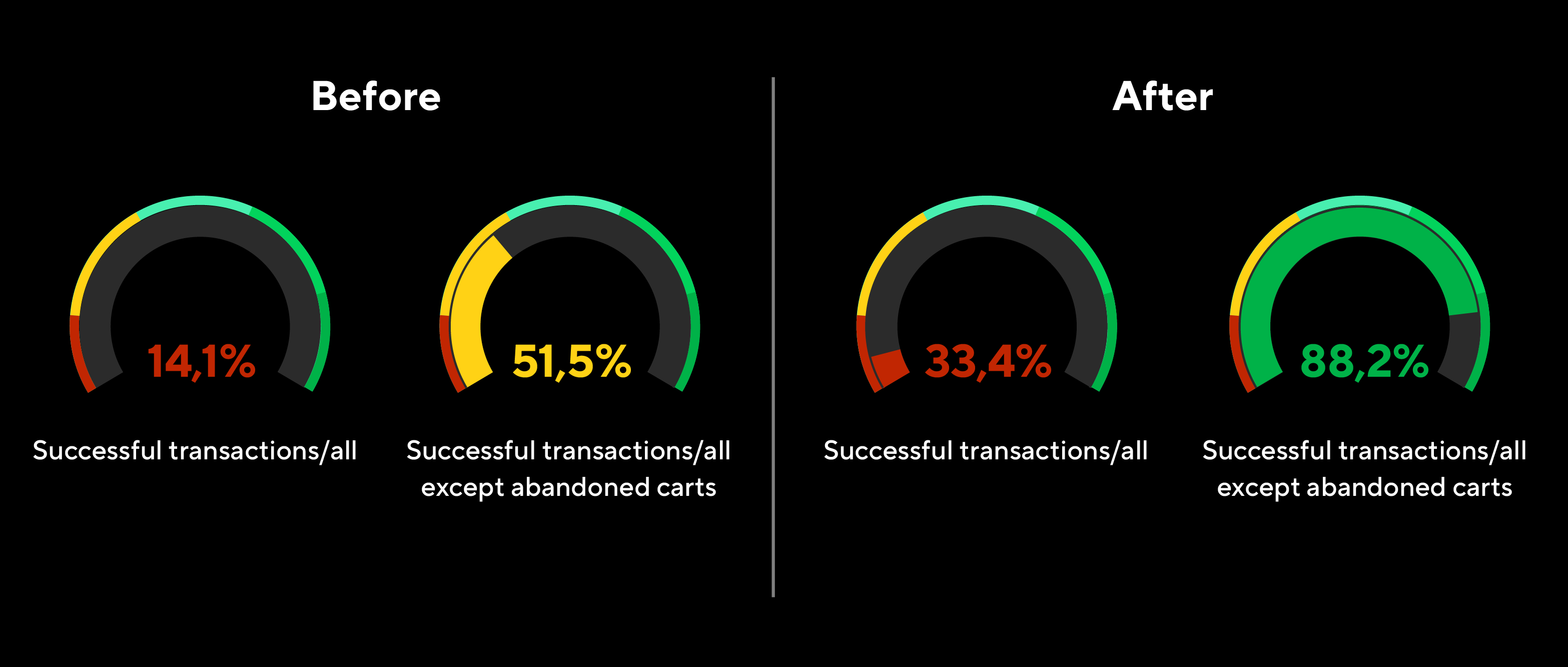
Another case is our forex client. We noticed that their acceptance rates in the African region decreased. After a thorough analysis, we identified two weak points that needed attention. First, the payment page design needed simplification because the loading time was too long, leading to abandoned carts. The second step was helping our client choose the most relevant payment provider for this region to improve payment acceptance rates. Check the results on the graphs!
Enhancing the checkout process is a multifaceted strategy that requires attention to detail, a deep understanding of customer behaviour, and continuous optimisation. By implementing the strategies outlined in this guide, e-commerce businesses can significantly improve their checkout conversion rates, leading to increased sales and customer satisfaction. The key is to start small, test continuously, and always keep the customer's experience at the forefront of your optimisation efforts.